The Hook
Sending money in Nigeria is easy—until you have to send it to many people at once or remember to do it again every week. PayNest solves this with one clean workflow: Send. Split. Schedule. Done
Project Overview
Product: PayNest—Smart Multi-Transfer Fintech App
My Role: Lead UX/UI Designer
Timeline: 3 weeks (Design Sprint)
Team: Solo concept project
Tools: Figma, Miro, Notion, Maze (for testing)
The Problem
Business-finance products have a simple promise:
Transfer of money. Get paid. Keep the business going.
When a payment doesn't go as expected, that promise is fragile.
A move could be underway. An account may be suddenly restricted. Verification can fail. A payment may be delayed for network or bank processing issues. A user may not know that funds were taken out. The next step that is visible might be support, and there is no indication of ownership or resolution time. ed.
For a business owner, these are not minor inconveniences.
A delayed supplier payment can interrupt stock replenishment.
An uncertain customer payment can distort cash-flow decisions.
A restricted account can prevent the business from operating.
Across the reviewed products, the recurring need was not simply for more features. Users needed clarity, continuity, and control when something went wrong.
The central problem
Small-business operators need a dependable way to understand, verify, and recover from payment and account issues without being left uncertain about their money.
What I investigated
I started with a competitive review of three Nigerian business-finance products:
-
Nomba
-
Business Moniepoint
-
Business Kuda.
I looked at their product positioning and chose Google Play reviews and then grouped the evidence into common themes.
The review corpus consisted of nine named reviewers (three per product). Since this was a small, selectively surfaced sample of public reviews, I took the findings as directional, not statistically representative.
Why this problem needed attention
I looked through the public reviews and featured reviews on Google Play for Moniepoint Business, Nomba, and Kuda Business. The overall ratings were positive, but the detailed reviews showed that trust is eroded in times of uncertainty.
Moniepoint users complained about slow transactions, inability to get paid by some banks, repeated verifications, missed payment alerts, and the need for a better transaction search. A reviewer said they accepted documents, then they asked for them again, then transactions were not available, and money was stuck. One said a later update sped up logging in and transactions.
Nomba reviewers mentioned issues with the readability of charges, account limits impacting access to funds, card reliability, and a potential weakness in authentication. One reviewer specifically noted the previous version made withdrawal charges easier to understand, as the charge was visible without having to open each transaction.
Kuda Business reviewers said they ran into issues with payment lag, frequent network errors, logging out while paying, problems linking accounts, issues with passkeys, and an unresponsive support entry point. One reviewer wished for auto bank matching when pasting in an account number.
I did not take these reviews as evidence that all users had the same problems. The reviews available were a small, selectively surfaced sample, and they were from different versions of the app. But they also uncovered a common design opportunity: business users need more clarity and control in instances when financial actions are delayed, constrained, or unsuccessful.
What business users are trying to do
The users behind this problem are not trying to “complete a bulk transfer.” They are trying to finish an important business obligation without making a costly mistake.
A shop owner may be paying several suppliers. A small business may be processing monthly salaries. A freelancer may be paying contractors. An agent may be making several transfers while dealing with inconsistent connectivity. The task changes, but the underlying need is similar: send the right amount to the right people and know that the obligation is complete.
Scheduled payments create a similar responsibility. A user may schedule rent, utilities, subscriptions, or payroll and expect the app to help them remember and execute the payment. If the balance is insufficient or the bank response is delayed, the user needs an explanation and a safe next step rather than a silent failure.
What I learned from the research
The research did not simply tell me that payments can fail. It showed the kinds of uncertainty users already experience in business-finance apps.

The decisions I made
The Real Pain Points
Fragmented Experience
Users manage 2 to 3 different apps to meet their various transfer needs.
Network Anxiety
Poor connectivity undermines the reliability of batch operations.
Memory Burden
There is no dependable method for automating or tracking payments.
Trust Issues
History of problems with failed scheduled payments from other payment platforms.
Visibility Gap
No clear overview of upcoming financial commitments.
I started with "Crazy 8s" sketching sessions, exploring wild ideas
-
Very friendly and easy interface
-
Total spend and budget
-
Social payment splitting
-
Calendar-first payment interface
Information Architecture
An information architecture was developed to address user needs and research findings, ensuring intuitive navigation and quick access to essential app features.

User flow
After completing my research, I set out to develop a feature that simplifies transactions for users. This feature will inspire users to take control of their financial health and master their expense management.
Wireframe
With intricate graphics and interaction that make the user experience come to life, the low-fidelity wireframe displays Nestpay's sophisticated design.


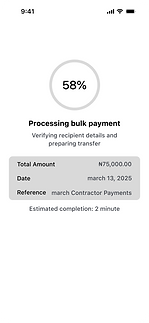


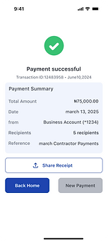
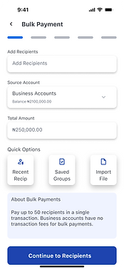
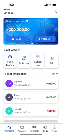
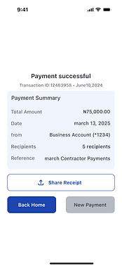
High fidelity Wireframe
When I dove into Figma, that's when I really came to life. This was my favorite part—turning strategy into concrete, clickable experiences—after all the user journeys, research, and edge-case preparation. It was very satisfying to create the processes, worry over the user interface, and watch the result take shape. Figma turned into my creative and precise playground, where all the parts came together to create a smooth, user-friendly experience.